It’s been 30 years since the world’s first website launched in 1991. It’s incredible how fast the computer science industry has grown within that short time frame and even more fascinating to see how much it’s evolved.
By Jaya Lord, Veugeler Design Group
Today we live in a multi-screen society where information is quite literally sitting in the palms of our hands and is only a “swipe up” away. So, what does this mean? It means that you have to keep up with ever-changing trends. Below are seven trends in web development and design that you do not want to overlook in 2022.
1. Responsiveness
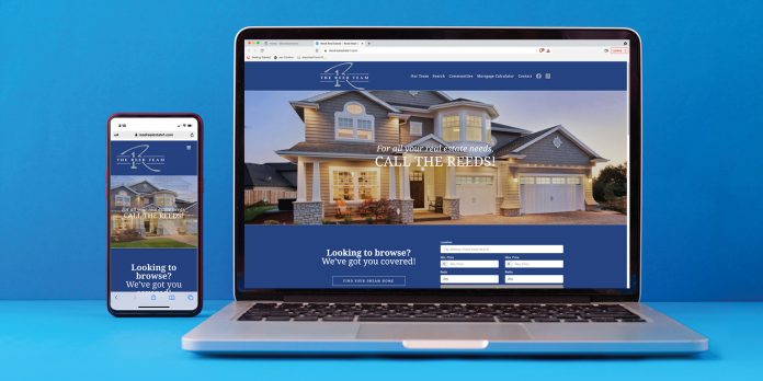
Not all trends are new or go out of style, and responsiveness is one of them. Have you ever accessed a website on your smartphone and found yourself scrolling for five minutes to read the information? Have you had to turn your phone sideways to access the site menu? If you answered yes, then you were on a non-responsive site! In short, a responsive website automatically scales its content and elements to match the screen it is viewed on. Having a responsive site not only improves user experience, but also enhances your search engine optimization and flexibility.
2. Parallax Animation
Possibly the hottest trend this year, parallax animation is a graphics technique that creates an illusion of depth by allowing background images to move slower than the foreground images. Not only is this eye-catching, but it generates an immersive experience for the user. This effect is an efficient way for our developers to incorporate an additional layer of dimension and flare that keeps website visitors engaged.
3. Page Transitions
In addition to parallax animation, page or scrolling transitions have made a significant impact on website activity. Transitions can increase time spent on the site by giving the visitor a more entertaining and interactive experience. Depending on your audience, you may need a quick transition so that users can access information faster while others may prefer more elaborate transitions that show off their dedication to customer service. User experience is crucial, from smaller details like movement while scrolling, to larger accents like page transitions.
4. Simple Menu and Header
Organizing and prioritizing menu options is important to a successful website. A condensed menu that is user-friendly will enrich the layout and design. This helps keep the header clean and easy to navigate while avoiding any unsightly text wrapping that can occur during optimization if there are too many menu options.
5. Branded Content
While the functionality of the site is certainly the main priority, the look and feel of each page are equally impactful. Working with a website team that focuses on both design and development is extremely advantageous. A graphic designer and web developer should work hand-in-hand to create a site that is not only functional, but aligns with client branding. A designer’s eye can arrange the content in a way that guides the user straight to the information they intend for them to view first. Utilizing the various weights within a font family, consistently adjusting font sizes throughout the pages, and strategically placing copy and photos from top to bottom are just a few ways to achieve this.
6. Neutral Colors and Gradient Backgrounds
Piggybacking off of #5, colors and textures matter! Neutral colors often evoke feelings of happiness. As our brains associate emotions with colors, it’s important to have a website that flaunts an inviting, fresh palette. However, companies who have brand colors that are brighter can still integrate a more neutral color palette by using the bolder shades as accent colors. This serves as a complementary balance to the eye while staying within brand guidelines. And, an effective way to add texture could be something as simple as a gradient background, which truly adds life to the page without causing disruption to the content.
7. Animated GIFs
Visuals are everything to consumers, from colors to photo quality, because they can convey a message that is not written. An alternative yet successful way to catch someone’s eye is to consider including animated GIFs. This is highly recommended by our web developers as gifs can be customized to your brand and are much smaller in size compared to other large format files such as videos that could potentially increase your site’s load time. If your website is not something you’re bragging about, it may be time to give it the attention it needs! A knowledgeable web design team can help explore how sprucing up your website could benefit the way your consumers view your company and brand. Whether it’s a refresh or complete overhaul, a smartly designed website can attract — and keep — the attention of your audience.
Veugeler Design Group is located at 554. W Main Street, Unit A200 in Buford. For more information, call 678-482-2270 or visit www.vdgatl.com.


